Showing posts with label Altenew Academy. Show all posts

Thursday, February 3, 2022

Feathered Lily

Hello Friends and Happy Friday Eve (for those optimists out there).  I have a quick post today featuring a card created using a gorgeous Lily image from the latest Altenew Craft Your Life Kit: Feathered Lilies.

 This is a larger than life stamped image and I've created a 5x7 card,  just look at the size of this stamped image.

 
Using my Misti stamp positioner, I stamped the floral on a 5x7" card panel and without removing the stamp from the Misti Lid, I stamped again on the largest die cut label from the Nesting Slim Labels Dies from Altenew. 

I heat embossed and colored the image on the label using Spectrum Noir Alcohol Markers.  As you can see, the largest label die cut is a hair taller than 7".


The die cut was popped on craft foam for dimension and lined up to match the stamped image underneath.  The sentiment is from the same stamp set and a few crystal gems were added for additional interest.

This completes my post for today.  I hope you're staying healthy and warm; the news reported a blizzard in the midwestern states so I'm praying all is well and everyone is hunkered down, enjoying comfort foods and crafting time.

Until next time, Happy Carfting!

Donna

**Challenges Entered:
As You Like It - True Love has to be the most important to me but I also wouldn't be the person I am today without the fabulous and long term friendships I have made throughout my life
TTCRD


Friday, January 28, 2022

Altenew Academy Level 2 Course: Masking Unleashed

Hello Crafty Friends!  Today I'm sharing a card created for the Altenew Academy Level 2 Course:  Masking Unleashed.  This course focuses on Masking tips, tricks and techniques for creating interest in your cardmaking. 

For my card, I've used the Altenew "Indoor Garden" Stamp Set to create a Friendship Card.  I like to have a nice variety of card themes in my stash and friendship cards are ones I send often.


  1. To start my design, I've created a background panel that looks like it's been stenciled but the leaf design has been created using masks.  I die cut several leaf masks using a die from the Altenew "Poppy Arrangement" Die Set.  I also die cut an Oval from the masking paper as well.
  2. I arranged the leaf masks in a random pattern and layered the oval mask over the leaves making certain all the masks were adhered very well.
  3. I ink blended over the masked panel using a light pink and used a darker shade along the edges.  
  4. I set the panel aside to dry; I wanted the ink to dry completely before removing the masks.
  5. Once the panel was dry, the masks were removed to revealed the "faux" stenciled background.  I stamped the succulent images and basket directly to the panel using varying shades of blue and green inks.  
  6. The sentiment, from the Altenew Paint-A-Flower Himalayan Poppy Stamp Set, was stamped directly to the panel.  
  7. Before adhering the inked panel to the black mat, I wrapped Altenew's Enchanted Gold Metallic Thread  around the card to give the potted plant a "landing" spot so the image wouldn't appear to be  floating in air.  
  8. Lastly, all were adhered to a 110 lb. cardbase and black gems were added for additional interest.


This was an enjoyable class and the best bit was using die cut masks to create a faux stenciled look.  Why didn't I think of this technique?  Thanks to the course, I'll use masks more often.  

This completes my class project and also completes all of the coursework in Level 2.  I now await my Level 2 Final Assigment.  I'll be back soon with the projects for that!

Until next time, Happy Crafting!

Donna

**Challenges Entered:
As You Like It - I like to add color by ink blending but my fav way is with alcohol markers


Wednesday, January 26, 2022

Altenew Academy Level 2 Course: Magical Markers Techniques

Hello Friends!  Today I'm sharing a card created for the Altenew Academy Level 2 Course:  Magical Markers Techniques.  This course focuses on tips, tricks and techniques for using your Alcohol Markers in creative ways.  

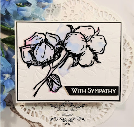
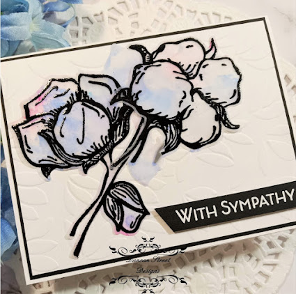
For my card, I've used the Altenew "Cotton Comfort" Stamp and Coordinating Die Bundle to create a Sympathy Card.  I don't have a need for this type of card at the moment thank goodness, however I thought the Cotton Blooms lent themselves to a Sympathy card.  


  1. To start my design, I wanted to create a card that had a soft color palette so using medium shades of pink and blue alcohol markers, I laid down color on vellum.  There was no rhyme or reason to how I added the color; I just scribbled the color on using the markers' broad tip.
  2. Using an eye dropper, I applied 91% Isopropyl Alcohol to the vellum and moved the alcohol ink/isopropyl alcohol mixture around with a Rocket Air Blaster.  The colored areas dried almost immediately due to the alcohol evaporating so quickly.  
  3. Using a stamp positioner, I stamped the images directly onto the colored side of the vellum.  TIP:  Because I've stamped on Vellum and did not use a Solvent Ink such as Staz-On, I must heat emboss because the pigment ink will not dry on this non-porous surface.  
  4. Using the coordinating dies, I cut the images and set aside to prepare the card panel and sentiment.
  5. The background was a little too plain for my liking so I embossed the panel with a leaf patterned folder.  
  6. The sentiment; from the same stamp set, was stamped and heat embossed using fine detail white embossing powder.  TIP:  When embossing, remember to use your anti-static powder.  When I heat emboss on black card, I add more anti-static powder than I think I need.  This always ensures I get a crisp emboss.
  7. I arranged the cotton picks and once I was pleased with the layout, I picked it up with Press and Seal Plastic Wrap.  This is my "go-to" method for picking up arrangements and guarantees I won't have to fuss with it again once I have it the way I want it.
  8. To adhere the vellum to the panel, I carefully applied liquid adhesive to the thick parts of the image outline.  I purposely left some areas of the image without adhesive so there would be a bit of dimension.  The sentiment strip was popped on craft foam.  


This completes my class project and I'm pleased with the result.  This was a fun class and I enjoyed the planning process.  This particular technique was not shared in the course however the course provided the ideas and I provided the design. 

Until next time, Happy Crafting!

Donna

**Challenges Entered:

Saturday, January 22, 2022

Altenew Academy Level 2 Course: Impressive Heat Embossing

Hello Crafty Friends!  Today I'm sharing a card created for the Altenew Academy Level 2 Course:  Impressive Heat Embossing.   I love to heat emboss so this class was right up my alley.  This course covered tips, tricks and techniques for adding heat embossing in ways that differ from the standard stamp and heat embossing method.  

For my card, I've used the Altenew "Here For You" Stamp and Coordinating Die Bundle to create a Sweet and Simple Card....my term for a Clean and Simple Card that had a bit more pizazz.


  1. To start my design, I stamped and heat embossed the large coneflower using watermark ink and fine detail Gold Embossing Powder.  The flower was cut using the coordinating die.
  2. Using Staedtler Watercolor Pencils, I've watercolored the floral and leaves then set aside to dry.
  3. To prepare the background, I created a frame using an Embossing Pen and Fine Detail Gold Embossing Powder.  TIP:  I scored the panel at 1/4" on each side before going over the line with the embossing pen. This created a "trough" and gave the embossing dimension.  
  4. The sentiment, from the same set, was stamped with watermark ink and heat embossed with the same gold powder.
  5. To create additional interest in the background, I splattered the card with water, sprinkled with powder and heat embossed again.  The powder will stick to the water droplets and this technique was one shared in class.  I never thought to use water instead of watermark ink to emboss with.
  6. Lastly,  I've adhered the panel to a 110 lb. card base, popped the floral on craft foam for dimension and placed it on the embossed panel.

This completes my class project and I'm impressed with the result.  The Altenew Academy classes have taught me so much and it's been a fun time learning so many cool tips and techniques.  I have 2 more classes to go before compeleting Level 2.  I'll be back with another AECP project soon.

Until next time, Happy Crafting!

Donna

**Challenges Entered:
AYLI - Favorite coloring medium is alcohol markers but my next fav is watercolor as in this project


Saturday, January 15, 2022

Altenew Academy Level 2 Course: Color Your Day

Hello Everyone, I'm back to share another Altenew Academy course project.  Today's card was created for the Level 2 Course:  Color Your Day.  This 6 part course covered techniques and ideas on adding splashes of color to projects for visual interest and fun.

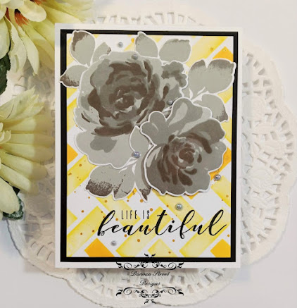
For my project, I've used the Altenew Fantasy Floral Stamp and Coordinating Die Bundle along with stenciling to create an interesting design.  My design was directly inspired by one of the projects the instructor, Therese Calvrid completed in the course.  


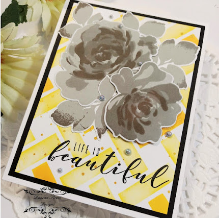
To begin my project, I considered a design for the background and the colors I wanted to use.  I decided upon a simple yet effective neutral focal with a bright background.  The floral set are layering stamps so using all 4 inks in the Altenew Gentlemen's Gray Crisp Dye Ink Mini Cube Set,  I stamped from light to dark, building up the colored layers.  I die cut the florals and leaves with the coordinating dies and set aside to prepare the background.

Using a light shade of yellow ink, I blending over the entire stencil then came back with a darker shade of yellow and blended in a few areas.  If you'll notice, I varied my pressure when blending the light yellow so I would get the look of using more than 2 inks; parts of the lighter color is even lighter within the area and that was due to the pressure I applied when blending.  Once I was happy with the stenciling, I splattered the panel with Gold Watercolor Paint and set aside to dry.


Once the panel was completely dry, I stamped the sentiment from the Altenew More Than Words Stamp Set.  In hindsight, I should have stamped the sentiment prior to splattering with the gold watercolor but as it happened, there were no splatters where the sentiment was stamped.  That was pure luck and next time, I will stamp the sentiment prior to splattering.

To complete the card, I adhered the stenciled panel to a black mat, arranged the florals and adhered to the panel flat using liquid adhesive; only popping the front floral on craft foam.  Gray Opal Pearl Embellishments from Kat Scrappiness were added for additional interest.

This was a fun course and I thoroughly enjoyed it.  It's fun to experiment with color in your designs; I wouldn't have thought to use florals in a neutral color but in doing so, the bright background made those florals Pop off the page, even if they are gray.

Thanks for stopping by, I appreciate your visit.  Until next time, Happy Crafting!

Donna

**Challenges Entered:

Friday, January 14, 2022

Altenew Academy: Beautiful Details

Hello everyone and Happy Friday!  Today I'm sharing a card I've created for the Altenew Academy Level 2 Course:  Beautiful Details.  This course was one of my favorites thus far but also the most challenging for me.  It's not a difficult course however it pushed me to experiment with technqiues and "let go" of my need to stay within my comfort zone.

My card today features florals from the Altenew "Majestic Bouqet" Stamp and Coordinating Dies Bundle.  This is a huge, gorgeous set that I find myself coming back to often.


For my card, I wanted to create a sketchy design, so using a technique taught in the course, I "inked" 1 layer of the floral and leaf images with a Sakura Pigma Brush Marker and stamped.  By inking the stamp with the marker, I got the sketchy, textured look I was going for.  

TIP:  The Sakura Brush Markers are filled with archival ink and the ink dries quickly.  In order to get the image stamped before the ink dried, I used the "huffing" technique.  If you're not familair with this technique, you breathe warm, moist air on the stamp making that familiar huffing sound when blowing the air from your mouth...thus huffing on the stamp.  This proccess keeps the ink moist for a bit..long enough to stamp.

I stamped the image outline over the color in order to distinguish a flower and leaves.  Now, this is where I had to "let go" of my need to continue adding color. I had a difficult time just leaving it alone to let those streaky, sketchy lines just be......and this is so not my style.  I die cut the images and set them aside to prepare the background.


I wanted the background to match the sketchiness of the images but didn't know what to do.  I thought about stenciling, hot foiling and watercoloring a background but those didn't appeal to my idea.  Then it came to me, if I drag an ink pad down the card with just 1 pass, it would provide a sketchy look so that's what I did.  

Using "Silver Lake" Crisp Dye Ink from the Gentlemen's Gray Mini Ink Cube Set by Altenew,  I made a few passes down the card to get some background interest.  To complete the background, I splattered with pink ink and doodled lines with dots using a Uni-ball Deluxe Micro Pen. 

To complete the card, I arranged the florals and adhered to the card panel, popping up the front floral on craft foam.  My sentiment was made using a Dymo Label Maker and the last beautiful detail I've added were Gray Pearl embellishments from Kat Scrappiness.

I didn't think this design was going to make it's way to completion.  I had my doubts but after it was completed, I can honestly say I'm happy with it.  I like the background and how it looks like old, weathered wood.  I love the sketchy, artsy look of the florals and leaves.  The Altenew courses have been so much fun and I have finished each course with a fresh outlook on techniques.  The courses I've enjoyed the most have been those that have pushed me out of my comfort zone.  It's a lesson in letting go and letting your creativity take over.

Until next time, Happy Crafting!

Donna
 
**Challenges Entered:


Sunday, December 19, 2021

Altenew Academy Level 2: Polychromatic

Hello Crafty Friends and Thanks for visiting!  Today, I'm sharing my submission to the Altenew Academy Level 2 Course:  Polychromatic.  The course lessons detailed ways to create colorful projects using a variety of coloring mediums and explains the term Polychromatic and brought to my attention something I've been doing for years with actually naming it. 

The definition of Polychromatic is showing a variety of 2 or more colors; multicolored.  Polychromatic designs are my favorite and the style I most use.  For my project, I've used 3 complimentary colors, 1 of which uses a monochromatic palette to create a Card of Encouragement.


Using the Fantastic Floral Fantasies Creativity Cardmaking Kit by Altenew, I die cut the layering flowers using colored cardstock I created with Gansai Tambi watercolors.  I used light, medium and dark shades of pink for the florals and shades of greens for the leaves.   Prior to die cutting, I splattered the card with white paint and spritzed with Shimmer Mist.

I embossed a panel using a Basketweave patterned folder and adhered to a cardbase of 110 lb. Neenah Solar White card.  I arranged the florals and leaves and picked up the arrangement using Press and Seal plastic wrap.  *Tip:  using Press and Seal to pick up the arrangement keeps it together and makes it easy to adhere when ready.


The sentiment is die cut from a Christmas present I received from a dear crafty friend; I love the thin and scripty font.  Lastly, I've added black enamel embellishments from Kat Scrappiness.  The black sentiment and embellishments add the perfect amount of contrast to create a POP of color from this gorgeous florals and leaves.  

You're probably creating polychromatically without thinking about it.  I know I do as I love lots of color in my designs.  The Altenew courses are interesting and extremely useful in terms of ideas and inspiration.

Until next time, Happy Crafting!

Donna

*Challenges Entered:


Friday, December 10, 2021

Altenew Academy Level 2 Course: Creative Watercolor Media

Hello Crafty Friends!  Today I'm sharing my project for the AECP (Altenew Educator Certification Program) Level 2 Course:  Creative Watercolor Media.  The basis of this course is to teach, share and encourage the use of various watercolor techniques.  For my project, I've created a Happy New Year Card with an ethereal background using watercolor paints and shimmer spray.


To start the cardmaking process, I created a dreamy background panel using Gansai Tambi watercolor paints and Strathmore Watercolor card.  For this technique, it's best to use watercolor card as the process does use a fair bit of water and the card must hold up. 

Mixing shades of blues and purples, I dropped watercolor randomly on a pre-dampened panel of watercolor card.  Using my heat tool, I dried the panel in between adding color in order to build up the color without turning them "muddy" or loosing the intensity of each color.  

Once I was happy with the color combination, I set the panel aside to dry completely.  Once dry, I spritzed the panel with Shimmer Spray and set aside once more to dry.


Next was to stamp, heat emboss and die cut images from the new to me Altenew "Happy Dreams" Stamp and Coordinating Die Set.  Using complimentary shades of colored embossing powders to match the background panel, the images and sentiment were stamped and heat embossed.  The images were cut using the coordinating dies and the sentiment was cut using a circle die.


I did a dry run arrangement on my panel so I would know where I could stamp stars and 2 additional sentiments.  Using the Altenew's "Cloudy Night" Crisp Dye Ink mini cube; which is part of the Gentleman's Gray Mini Cube Set, I stamped the star clusters and sentiments.  I preferred the look of gray ink here; not as harsh as black and it fits my ethereal theme.

Lastly, time to arrange my focal images and once arranged, I picked up the cluster using Press and Seal Plastic Wrap in order to keep everything in it's place.  I've added craft foam behind the cluster and adhered to the panel using liquid adhesive. To complete the design, I've added Gray Opal Faux Pearls.

I'm very pleased with this watercolor technique; it's easy and creates wonderful results.  Each time you play with watercolor in this way, no two backgrounds will be the same and that appeals to me.  

Thanks for visiting today and until next time, Happy Crafting!

Donna

**Challenges Entered:


Friday, December 3, 2021

Altenew Academy Level 2 Course: In the Mood for Color

Hello and Happy Friday!  I know it's been a few weeks (months maybe) since I've posted a course project for the Altenew Certified Educator Program.  I'm back on track and today I'm sharing my project for the Level 2 Course:  In the Mood for Color.

This course was enjoyable and each class is a lesson on individual color and how it relates to our emotions.  I've always known that colors can affect our emotions and even our purchasing decisions; pay close attention to the next advertisment / Televison commerical you see...notice how they tie color to the theme and what they are promoting.  

Purple has always been my favorite color.  I'm immediately drawn to purples, lilacs and lavendars; I even love the smell of lavendar.  Purple has long been associated with Wealth, Royalty and Luxury but it is also Calming, Spiritual and Romantic.


For my course submission, I've chosen to use Purple as my main color choice and the Altenew Poppy Arrangement Stamp and Coorindating Die Set to create an A2 sized card.  This set is new to me and naturally, the purple poppy variety are my favorite, then I would choose the traditional red flower.


To start, I stamped the floral image using Memento Tuxedo Black ink; which is an alcohol marker compatible ink, onto a snippet of specialty cardstock that's recommended for alcohol markers. I colored the image and die cut using the coordinating dies.  

I've created a panel by stenciling and ink blending with 2 shades of purple ink.  I sprayed the panel with black and white gloss acrylic spray and set aside to dry.


I've stamped the sentiment, from the same set, and die cut using an oval die.  I've trimmed and adhered the inked panel flat to a cardbase of 110 lb. heavyweight cardstock.  The sentiment and floral were popped on craft foam for dimension and arranged on the card panel.  Lastly, faux violet pearl gems have been added to more interest and shine.

I love color and incorporate color into my projects, home decor and clothing.  I'm drawn to certain colors; specifically reds, yellows and blues but purple is my number one choice every single time.  I have many of the personality traits that represent purple also:  Introvert, Creative, Sensitive, Compassionate, Dreamer, Emotional.  If you haven't checked on your Color Personality, do so.  You'll find it interesting and will discover you ave many of the personality traits that your color represents. 

Thanks for visiting today.  Until next time, Happy Crafting!

Donna

**Challenges Entered:


Saturday, October 9, 2021

Altenew Academy AECP Level 2: With A Twist

 Hello Friends and Happy Saturday!  Today I'm sharing my submission for the Altenew Academy Level 2 Course: With a Twist.  I had no idea what this course was going to entail but I was impressed with the "Twists" on familiar techniques.

For my project, I used the Faux Embossing Technique that was covered in the course.  I wasn't quite sure what faux embossing was and had a different idea of what it may be, only to be surprised this technique is easy to create and very effective.

I started with stamping several of the blooms and leaves from the Altenew Watercolor Blooms Stamp and Coordinating Die Bundle in an Autumn color palette.  After inks were thoroughly dry, I die cut all with the coordinating dies.


The "faux embossing" comes in because the die cuts appear to be embossed into the card panel and then colored; especially if the border around each die cut completely matches the card base.  In this case, I used 80 lb Neenah Solar White for the die cuts and 110 lb Solar White for the panel.


In this close-up, you can see the outline of each die cut, but in the 1st photo, the edges seem to blend in.  It's a brilliant trick of the eye and a wonderful technique to try.  I fell utterly in love with this look and very pleased to have learned something new.  Each Altenew Academy course I've completed has taught me something new; whether it be a new technique or a spin on a tried and true technique....a "Twist" if you like.  For the final touch, I've added Chocolate Gems throughout the panel.

Thanks for stopping by and taking your time to read my post, I appreciate your visit and comments.  Until next time, Happy Crafting!

Donna

**Challenges Entered:


Saturday, October 2, 2021

Altenew Academy - In the Mood for Color

Happy Day to You!  I'm sharing a card created for the Altenew Academy Level 2 Course:  In the Mood for Color.  This lesson covered Colors, the Emotions that can be linked to them and various coloring techniques.  For my submission, I chose to use the color Red and the Altenew Craft-A-Flower Camellia Stamp and Coordinating Die Set along with shade stamping.


The color Red can make you feel Passionate and Energized.  It is often associated with Love as well as Danger and Anger.  I chose the color Red for the passionate, energized and love feelings it provokes.  I created a Holiday card using traditional colors and a non-traditional floral.

To start, I stamp layered the images using 3 shades of red and green.  I die cut and set aside to work on the panel and background.  I inked an embossing folder with watermark ink and embossed 80 lb card with fine detail silver powder.  The shine along with the buffalo plaid paper and snowflakes say Christmas to me.    


To put it all together, I matted the plaid paper with black card, rounded the corners of the embossed panel and adhered using craft foam for dimension.  Lastly, I adhered the bloom, leaves and sentiment strip flat to the panel. 

I love bright colors and create with them often.  When I look at this card, it stirs up emotion of great holidays past and those yet to come.  The red makes me happy and passionate about spending a great Christmas with family and friends this year.  How does it make you feel?

Until next time, Happy Crafting!

Donna

**Challenges Entered:
All Sorts - I love Bright Colors and Christmas
Creatalicious


Thursday, September 30, 2021

Altenew Academy - Beyond Basic Backgrounds

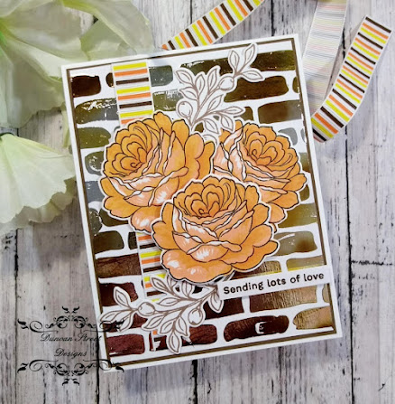
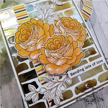
Hello Crafty Friends!  I've passed my Level 1 Altenew Academy courses and have been given the go-ahead to start Level 2.  The first course for Level 2 is Beyond Basic Backgrounds.  I thought I knew all the great techniques for creating awesome backgrounds but I learned a few more brilliant ones.  Today I'm sharing a technique that may not be new to you; and it wasn't to me either, but was one I needed reminded of.


One of examples had the Instructor using a foiling technique and I had all the supplies needed to do the same.  I stenciled Hot Foiling Gel through a Brick Wall Stencil on a panel of Neenah Solar White 80 lb. card.  I set the panel aside to dry and proceeded to work on the floral images.  TIP:  When using foiling gel, texture pastes and the like, wash your tools quickly and completely before the medium dries.  Once dry, it will be very hard to remove or possibly not be removable at all.

Using the Altenew/Simon Says Stamp Collaboration Set for Stamptember 2021; From the Rose Bush, I stamped layers of Yellow and Orange inks to create 3 Autumn Rose Blooms. For the sprigs, I stamped in a Light Brown ink and die cut all using the coordinating dies.

Once my panel was dry, I placed a piece of  foil on top of the dried gel, placed the panel in a carrier sheet (I use waxed paper) and ran it through my heat laminator. After allowing it to cool just a sec, I peeled the foil sheet away and what was left behind was a gorgeous, shiny, foiled brick wall design.


Next step was to arrange my florals and pick up using Press and Seal Plastic Wrap.  I adhered a strip of ribbon to the foiled panel and backed with brown card before adhering to my card base.  I added adhesive to the backs of my florals, leaving the front bloom without adhesive as I was mounting on craft foam for dimension.  I place the arrangement on the panel and made certain all were adhered well.  Lastly, I stamped a sentiment from the same stamp set, added craft foam behind the strip and adhered to the card front.  Project Complete!

This was a great lesson that refreshed techniques I've used in the past as well as shared techniques that were new to me.  It was nice to have a play with stenciling and foiling to create a very eye-catching background.

Until next time, Happy Crafting!

Donna

Challenges Entered:
As You Like It - Autumn is my Fav time of year.  I love the Colors and Crisp Air


Thursday, September 2, 2021

Altenew Academy AECP Level 1 Final Assignment

Hello and Welcome!  Today I'm excited to be sharing my Level 1 Final Assignment Submission for the Altenew Educator Certification Program.  The Assignment was to create a His and Hers Gift Card Set with 1 Recycled Element and Packaging to present the sets.  

The focus of the assignment is to incorporate what was learned from all the Level 1 courses, take 3 class components to create 4-6 cards and a presentation piece.  A List of Products used and a video are inserted at the end of this post, this has enabled me to keep this post reasonably concise.

 I will start with my feminine card set and outline the process.  

3 Components from the Classes:
1.  All About Layering
2.  Easy Die Cutting Techniques
3.  Let It Shine

The similar and cohesive theme with the feminine set is a Rainbow of Colors and each card has a die cut frame.


I chose 6 Altenew Layering Stamp sets for the floral elements of each card.  This class was the 1st class in Level 1 and was a game changer for me.  The class went over, in detail, how to properly line up the layers of the sets for a perfect stamp every time.  I was always intimidated with layering sets but now have confidence and have fallen in love with them!

The next component used was the Easy Die Cutting Technique which I used to cut the blooms and the frames that each card has.  The last component used was taken from the Let It Shine Course which explained several ways to add sparkle and shine to your projects.  I've added sequins to each card for that extra something special.

Next up are my masucline cards.  The similar and cohesive theme with this set is Nature with a Pop of Color.  
 
3 Components from the Classes:
1.  Clean and Simple Boutique Cards
2.  Celebration:  Stenciling Techniques
3.  Let It Shine


I chose 2 different Altenew sets for the Clean and Simple card designs.  The Clean and Simple Boutique Cards class was another game changer for me.  I rarely create CAS cards because I love vibrant colors and lots of layers but the class explained that CAS doesn't have to be boring.  I believe my cards show that.  

The next component used was the Stenciling Technique which added interest to the background of an otherwise stark white mat.  I ink blended lightly to give that Pop of color but keep things Clean.  

The last component used was taken from the Let It Shine Course which explained that rhinestone, gems and glitter doesn't have to be used to add sparkle and shine to your projects.  To achieve this element with the masculine cards, I've heat embossed the sentiments on each card and heat embossed the plants on 3 of the cards.  

Lastly, for my recycled element, I used gift bags that were left over from a bridal shower project.  I had 2 white bags and wanted to create a creative way to present the Gift Sets.


I keep the theme of the gift bags cohesive with the card sets they will contain by using the same stamp sets as the cards.  The Masculine Bag is stamped with the Spectacular Adeventures Set and the Feminine Set is stamped with various florals in Rainbow colors.   With a hole punch, I created a way to add ribbon to complete the look and to hide some mistakes made while stamping.  TIP:  When making a mistake, don't throw your project in the bin.  Push through and think of a creative way to save it.  

Here is a 2 minute video that you may enjoy that details the various steps used to create the cards.  For the best viewing experience, view it Full Screen by clicking the icon at the bottom left of the video snippet.


Altenew Products used in the creation of my cards are:


I thank you for visiting today, reading through my post and watching the video.  I appreciate all the lovely comments and encouragement on my posts.  I now sit with fingers crossed, hoping that I'm allowed to pass through to Level 2.  I'm looking foward to more exciting classes and creating more beautiful projects for you.

Until next time, Happy Crafting!

Donna 


Saturday, August 7, 2021

Altenew Academy Level 1 Course: Irresistible Inking Techniques

Hello Crafty Friends!  Today, I'm sharing a card created for the Altenew Educator Certification Program, Level 1 Course:  Irresistible Inking Techniques.  This class shared great ideas for using inks in creative ways and I was inspired to dust off my Gelli Plate for some ink printing.

For my card, I've used the July Paint-A-Flower Fashion Monger Dahlia Stamp Set from Altenew for the focal on the card.  


To start my project, I inked up my Gelli Plate with various shades of greens, using a brayer for blending the inks.  After inking the Gelli plate, I laid my 8.5" x11" card over top and rubbed.  I did this process 3 times, building up the color.  I wanted pattern, so for the last press, I placed a vintage screen stencil on the inky gelli plate, laid my paper on, rubbed and the pattern was left.  I set this aside to dry thoroughly to work on the focal image.

I stamped the image with alcohol marker friendly ink and colored with alcohol makers.  The ink smeared in areas around the flower centers, which made me sad.  After looking at it and thinking I should toss it in the bin, I decided I could save it but using my embossing pen and gold fine detail embossing powder.  Tip:  Before tossing your project in the Bin, think of ways to save it.  


For assembly, I lightly inked an the area on the card base where the focal image would sit lightly with pink ink.  I fussy cut the floral image and adhered craft foam behind.  I splattered the inked card with White Acrylic Gloss Spray Ink and cut a banner panel, then adhered flat to the card base.  I placed the focal image and sentiment and lastly, added sequins for shine.  

This is the last class in the AECP Level 1 set of courses.  I now wait for my final assignment for Level 1 and if I'm fortunate, I will pass and be allowed to proceed to Level 2.  Fingers crossed please!

Take care and until next time, Happy Crafting!

Donna

**Challenges Entered: